You can Download Chapter 4 Diagrammatic and Graphical Presentation of Data Questions and Answers, Notes, 1st PUC Statistics Question Bank with Answers Karnataka State Board Solutions help you to revise complete Syllabus and score more marks in your examinations.
Karnataka 1st PUC Statistics Question Bank Chapter 4 Diagrammatic and Graphical Presentation of Data
1st PUC Statistics Diagrammatic and Graphical Presentation of Data Two Marks Questions and Answers
Question 1.
What are diagrams and graphs?
Solution:
Frequency distributions when they are presented in Tabular form becomes dull and un¬interesting, moreover they require close reading of the figures to understand what is represented. Diagrams and graphs are the means of making the data easy to understand even by layman at a glance.
Question 2.
What is the Need/Objectives/Purpose for graphic presentation of statistical data ? Or Mention the uses of diagrammatic /graphical presentation, or How diagrams and graphs are useful in representing statistical data?
Solution:
- They are attractive and hence in News papers and magazines, diagrams and graphs are commonly used in advertisements.
- They gives Birds-eye view of the entire data at glance.
- They can be easily understood by common man.
- They can be remembered for longer period of time.
- They facilitates comparison.
Question 3.
What is one dimensional diagram?
Solution:
In one dimensional diagram only the height (length) is considered. They are mostly bar diagrams. Here, only one characteristic is considered to represent the data.
Question 4.
Mention the various types of one dimensional diagram?
Solution:
Some of the one dimensional diagrams are:
- Simple Bar diagram
- Multiple Bar diagram
- Component/Subdivided Bar diagram
- Percentage Bar diagram.
![]()
Question 5.
Name different graphs used for presentation of frequency distribution?
Solution:
Some commonly used graphs are :
- Histogram
- Frequency Polygon
- Frequency Curve
- Ogives.
1st PUC Statistics Diagrammatic and Graphical Presentation of Data Five Marks Questions and Answers
Question 1.
What are the general rules for drawing a diagram?
Solution:
General Rules for constructing Diagrams and Graphs are: –
- Every diagrams and should have a suitable Title and is written above it.
- The proper scale according with the size of the paper should be selected.
- It should be neat and clean .
- It should not be overloaded with more information
- To indicate different parts suitable shadings, colours, crossings should made use of.
- An Index indicating different shades colours, crossing etc. used should be clearly shown
- It should be complete in all respects
- It should be simple and self explanatory.
Question 2.
Write short notes on (a) simple bar diagram (b) sub divided bar diagram.
Solution:
(a) Simple bars or thick lines aredrawn to represent the items of the data. The length of the bar is taken in proportion to the magnitude of the item in the data. The proper width of the bar is taken merely for attraction, but’it is nothing to do with the data. It represents only one character of the data.
Ex- The figures of Imports, Exports, and Population etc. for few years are to be represented by simple bars.
(b) In subdivided bar diagrams, where in some problems it is required to represent more than one or two variables of the same kind, we use component/sub-divided bar diagrams. In this case each bar is subdivided to in to various components and different shades, crossings, colours are used, and an Index is given to that effect. These are useful in comparing the total magnitudes, along with the components.
Ex: The figures of expenditure of family, Exports or Imports of certain commodities, population according to sex,
Question 3.
What is a pie diagram? or What are Pie-charts?/Explain the construction procedure
Solution:
As in bar diagram, a bar is sub-divided to represent its components. Where as in the pie- diagram a circle is subdivided into sectors by subtending the angle at the circle. The total of the components are equated to 360° and each component is expressed in degrees. The area of the sector formed by the angle measured by the degrees of the component is proportional to the magnitude of that component. To distinguish between the different components shades, coloures are used. It is so called because, it resembles a pie (cake) and components resemble slices of the pie. It is also known as angular diagram or sector graphs.
Question 4.
Write short notes on
(a) histogram
(b) frequency polygon
(c) frequency curve
(d) Ogives.
Solution:
Histogram: – “A Histogram is a pictorial representation of graphs of frequency distribution by means of adjacent rectangles, whose areas are proportional to the frequencies represented” The Histogram can be constructed by taking variable (class intervals) on x-axis and class frequency (f) along y-axis. On each of the class intervals rectangles are erected. The width and height of the rectangles are proportional to the length of the class and class frequencies respectively.
The graph formed by series of such rectangles adjacent to one another is called Histogram. From the Histogram Mode(Z) can be obtained by joining the end point of the highest rectangle to the diagonal end point of the adjacent rectangles, and a perpendicular drawn to intersection of these lines to the x-axis, which gives the value of mode.
On the basis of Histogram, Frequency polygon and Frequency curve can be constructed. Frequency distribution with Inclusive class intervals should be converted into Exclusive and for unequal width of the class interval. Histogram is constructed with, width of the class interval against Frequency density (f/w).
Frequency Polygon: – This graph is preferred when two or more frequency distributions are required to compare on the same graph. It is so called because of its resemblance with the plane geometrical figure polygon (many angled) representing frequency distribution. We can construct polygon in two ways- By drawing first Histogram and then joining the. mid-points of the upper horizontal lines of each rectangles. Thus obtained polygons ends are extended to touch the base line at a distance of half class interval.
Another method of drawing a polygon is that by taking all the mid-points of the class intervals and the corresponding frequencies areplotted. Thus obtained end points are joined by straight lines. And end points are extended to reach the base line at a distance of half class interval.
Frequency Curve: – A frequency polygon obtained from the Histogram or direct by midpoints of the various classes, is not a smooth curve. Its boundaries are made up of straight lines and it has sharp corners, these sharp corners can be removed by a free hand curve drawn along the frequency polygon.
Ogives/cumulative frequency curves: – Sometimes it is required to plot a graph of variables which is less than some value or more than a value. So, in such cases we are required to add up the frequencies lying below or above a given point of variable. Thus added frequencies are called cumulative frequency. The curve obtained by plotting cumulative frequency and the respective variable is called cumulative frequency curves or Ogives.
There are two types of Ogives (i) Less than Ogive (ii) More than Ogive
- ‘If a curve is drawn for the cumulative frequency added from the top (l.c.f) and the upper limits of the class is called Less Than Ogive ’.
- Similarly ‘If a curve is drawn for the cumulative frequency from below (m.c.f) and lower limits of the classes then curve is called More Than Ogive’’
- Here the variable is taken along x-axis and l.c.f / m.c.f. along y-axis. The corresponding points are joined by a smooth curve. The resulting graph is Less/More than Ogive
![]()
Question 5.
What is a frequency polygon? How is it constructed?
Solution:
Frequency Polygon: – This graph is preferred when two or more frequency distributions are required to compare on the same graph. It is so called because of its resemblance with the plane geometrical figure polygon (many angled) representing frequency distribution. We can construct polygon in two ways- By drawing first Histogram and then joining the. mid-points of the upper horizontal lines of each rectangles. Thus obtained polygons ends are extended to touch the base line at a distance of half class interval.
Another method of drawing a polygon is that by taking all the mid-points of the class intervals and the corresponding frequencies areplotted. Thus obtained end points are joined by straight lines. And end points are extended to reach the base line at a distance of half class interval.
Question 6.
Distinguish between histogram and frequency polygon.
Solution:
A Histogram is a pictorial representation of graphs of frequency distribution by means of adjacent rectangles, whose areas are proportional to the frequencies represented”
Where as frequency polygon is preferred when two or more frequency distributions are required to compare on the same graph. It is so called because of its resemblance with the plane geometrical figure polygon (many angled) representing frequency distribution. We can construct polygon in two ways- By drawing first Histogram and then joining the mid-points of the upper horizontal lines of each rectangles.
Question 7.
Write a note on false base line.
Solution:
Generally X and Y-axes begin from zero ie, the origin is at zero. When lowest value to be plotted is high and detailed scale needed to study all the variations in the data taking zero at the origin becomes impractical. Hence, if the fluctuations in the variable are too small, or if the lowest value of the variable is large, the False Base Line should be used, Here False Base Line can be shown by vertical wavy line between zero and first scale or the axes can be broken by kinked line.
Question 8.
From which diagram Mode can be obtained and how do you locate Mode graphically?
Solution:
Mode can be obtained from Histogram, and is obtained by joining the upper end points of the highest rectangle to the diagonal end points of adjacent rectangles, the intersection of diagonal end points a perpendicular drawn to the x-axis, which gives the mode.
![]()
Question 9.
From which curves Median can be obtained graphically/How do you locate Median graphically?
Solution:
Usually the two Ogives are drawn together with common axes. The point of intersection of two Ogives correspond to Median at the x-axis of the distribution.
Question 10.
What are limitations of diagrams and graphs?
Solution:
Graphs /diagrams are -only visual aids, and they cannot be considered as alternatives to numerical data.
- Graphs/diagrams are not accurate and gives only a rough idea of,the data.
- They cannot be used for further analysis of data.
- They can be easily misled and can create wrong impression about the data.
Question 11.
Write down any two Comparison of diagrams and graphs.
Solution:
- Diagrams give only an approximate idea where as graphs give more accurate information.
- Diagrams are drawn on plain paper where as graphs need graph paper.
- Diagrams can be easily understood than graphs.
- Time series and frequency distributions can be represented by graphs but not by diagrams.
- Diagrams are more suitable for publicity and advertisement, where as graphs are suitable for statistical analysis.
Question 12.
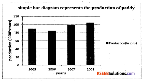
Represent the following data regarding the production of paddy (in ’000 tons) by . simple bar diagram.

Solution:
Following is the simple bar diagram representing the production of paddy
Question 13.
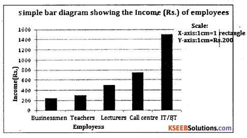
The incomes of the different categories of persons in Bangalore are given below:

Represent the data by suitable diagram.
Solution:
Businessmen Teachers Lecturers Call centre IT/BT Employees
Question 14.
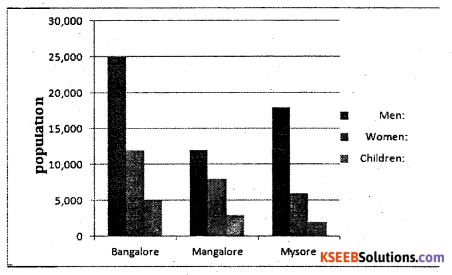
Draw the multiple bar diagram showing the working of men, women and children in the Bangalore
Table showing the sex wise population of Mangalore and Mysore.

Solution:
Multiple Bar diagram showing the sex and children wise distribution population of Bangalore, Mangalore and Mysore.
![]()
Question 15.
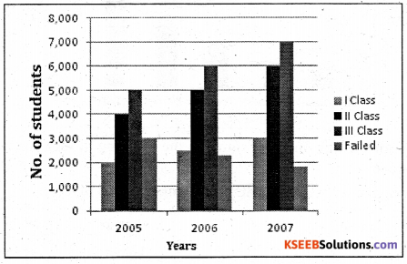
Present the following data in Multiple Bars of results of II PUC statistics examination in 2005, 2006, and 2007.

Solution:
Multiple bar diagram showing the result statistics of II puc students for the year 2005-07
Question 16.
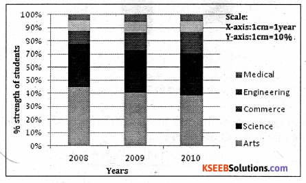
Following is the data regarding the strength of students of a university during 2008-10. constructs a percentage bar diagram.

Solution:
percentage of a value can be calculated using the following formula:
% of a value =(individual value/Total value) × 100
For the year 2008: Arts = (200/450) × 100 = 44.44, similarly calculate for the others.
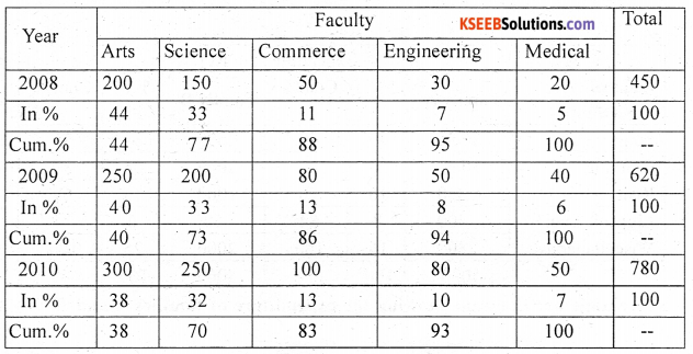
Footnote:Cum-cumulative percentage
Percentage bar diagram showing student’s strength of a university
Question 17.
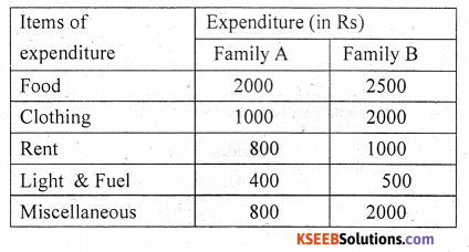
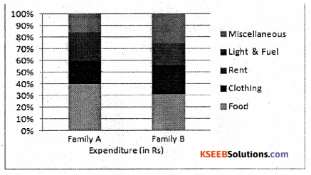
The following data relates to the. monthly expenditure (in Rs.) of two families A and B. Represent the data by a rectangular diagram on percentage basis.
Solution:
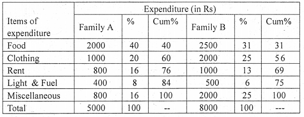
Percentage bar diagram showing the expenditure of families A and B
Question 18.
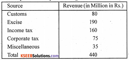
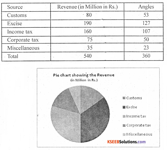
For the following data regarding the income of the government from different sources, draw a pie and component diagram :
Solution:
The angles for the components can be calculated as below:
The angle of an individual component = \(\frac{\text { Individual value }}{\text { Total value }} \times 360^{\circ}\)
For Customs: (80/540) × 360 = 53.33 ≅ 53 ; similarly calculate for the others also.
![]()
Question 19.
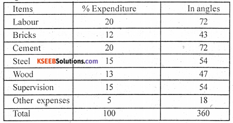
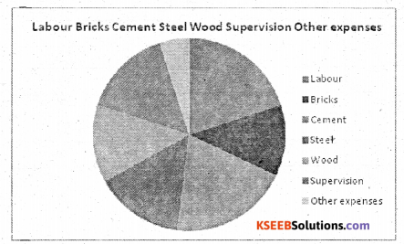
Percentage breakup of the cost of construction of a house in Bangalore (Excluding land cost) is given below :
Labour: 20% , Bricks:12%, Cement:20%, Steel:15%, Wood:13%,
Supervision:15%. Other expenses: 5% . Construct a pie diagram.
Solution:
The angles for the components can be calculated as below:
Angle of an individual component = \(\frac{\text { Individual value }}{\text { Total value }} \times 360^{\circ}\)
Angle for Labour = (20/100) × 360 = 72; similarly others can be calculated.
Question 20.
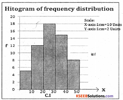
Draw a Histogram from the following data.

Solution:
Draw Histogram by taking the width of class intervals as 10 each and height with resect to – class frequencies.
Question 21.
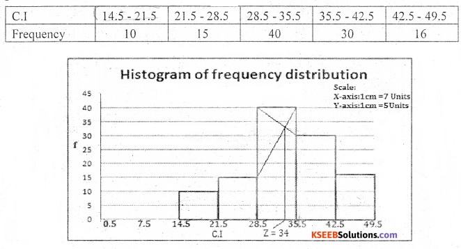
Draw a Histogram from the following data and locate the mode from the Histtogram:

Solution:
Convert the mid points as class intervals: the common difference between the mid points is 7, half of it is 3.5. Subtract 3.5 in all midpoints to get lower limits and add 3.5 to all upper limits to get upper limits.
To get mode (Z) join the upper vertices of the tallest rectangle to their opposite upper vertices of the rectangles adjacent it. Then from the point of intersection of these diagonals draw a perpendicular line to the x-axis, The point at which the perpendicular line touches the x-axis, gives the value of mode.
Question 22.
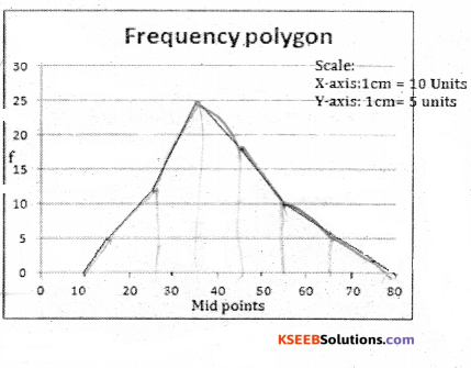
Draw a frequency polygon to the following frequency distribution.

Solution:
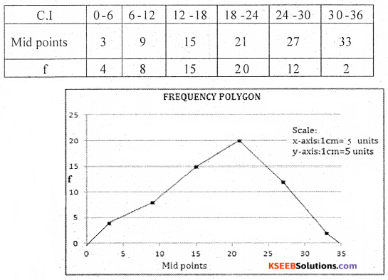
Here drawing frequency polygon for a continuous frequency distribution is same as of discrete frequency distribution. Simply plot the mid points against frequencies and join them by straight line and extend the end points to reach x-axis at a distance of half class interval.
Question 23.
Prepare a frequency polygon from the following data :

Solution:
To get polygon plot the points against micl points against the class frequencies then join the plotted points by a straight, extend the end points to reach the x-axis at a distance of half a class interval.
![]()
Question 24.
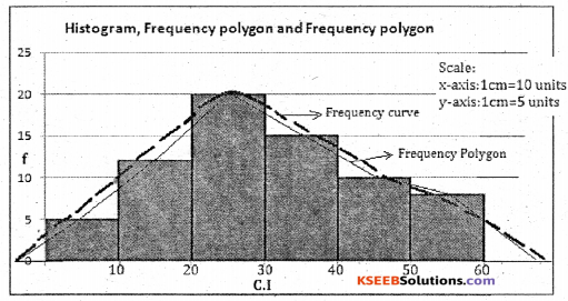
Draw the histogram, frequency polygon and frequency curve for the following data.

Solution:
First draw Histogram, obtain the polygon and then draw a smooth line along the polygon, which we get a frequency curve
Question 25.
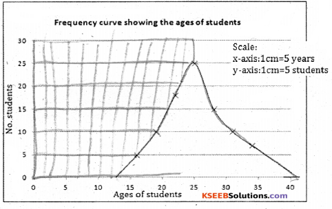
Draw frequency curve from the following frequency distribution.

Solution:
First plot the points mid values against the class frequencies and these points are joined by a free hand curve, which gives the frequency curve.

Question 26.
Draw Ogives for the following distribution and locate the median from the graph.

Solution:
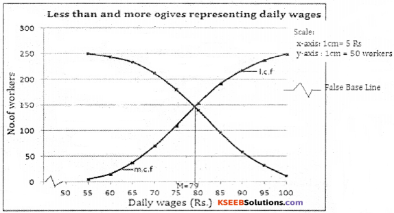
To get the less than ogive and more than, the upper class limits (lower class limits) are taken along X-axis and the corresponding less (more) than cumulative frequencies along Y-axis with appropriate scale . The plotted points on the graph are joined by smooth curve. The obtained curve is less (more) than Ogive.
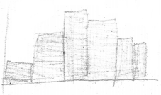
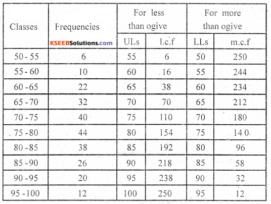
The point of intesection of ogives corresponds to Median of the distribution. From the point of intersection of two Ogives the perpendicular line (projection line ) is drawn to x-axis. The point on the x-axis gives the value of the median . From the ogives Median = 79.
Question 27.
Draw an Ogive and locate the median, lower quartile and upper quartile from the graph.

Solution:
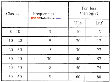
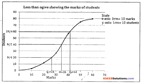
Median = (N/2)th term
(80/2) = 40th term
From the ogive M = 35 Marks
FirstlLowcr quartile Q1 (N/4)th term
(80/4)=2Oth term
∴ From the ogive Q1 =26Marks
ThirdlUppcr quartile Q3 (N/4)th term
= 3(80/4) 60th term
∴ From the ogive Q3 = 42Marks
![]()